Building a custom Leaflet control with React Leaflet
I found myself needing to build a legend control using the React Leaflet library . React Leaflet is a convenient library that abstracts Leaflet into React components and provides an interface between the two.
My initial attempt was to create a control following the example provided in the official documentation 1 ,
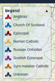
which suggested using CSS classes like leaflet-bottom and leaflet-left for positioning. While this approach rendered
the control correctly, I discovered that it existed outside Leaflet’s internal DOM container for controls.
This independence from Leaflet’s layout flow causes positioning conflicts where custom controls will overlap and clash
with other controls 🫣.

Map Control Component
To solve this problem, we’ll create a component that registers a Leaflet control and uses a React portal 2 to render child components inside it. This will allow us to build React controls that are then rendered directly within Leaflet’s internal DOM, improving the integration of our custom control and resolving the overlap issue.
Props
First, define an interface for the props that our parent component will use:
export interface MapControlProps {
  position: ControlPosition;
  disableClickPropagation?: boolean;
}The position prop is any valid Leaflet control position that places the control on the map. These can be any of the four
following strings: topleft, topright, bottomleft, bottomright.
The other prop disableClickPropagation is a boolean value, which when true prevents clicks on the control from escaping
to the map beneath. This is useful if you wish to allow the user to highlight text within the control.
Component Skeleton
Next let’s create a skeleton for our control. We know that it will need to render a child node inside a portal, so we’ll start there.
export function MapControl({position, disableClickPropagation, children}: PropsWithChildren<MapControlProps>) {
  const [container, setContainer] = useState<HTMLElement | null>(null);

  // TODO - register a new Leaflet control and get its reference

  return container ? createPortal(children, container) : null;
}The container state will hold a reference to the Leaflet control element and using createPortal we will be able to render
child components inside it.
Registering a new Leaflet control
To create a new control instance we can use Leaflets Control class. Then use the onAdd method to return an empty
<section> element when the control is added to the map. The container state will be updated to hold a reference to
this element.
To add the control to the map we need a reference to the map itself. React Leaflet provides a useMap hook that returns a reference to
the map for any descendants of the MapContainer. We will use it here when adding our control.
Finally, so that our map control renders whenever a prop changes, we place all this logic inside a useEffect hook, and the
props within its dependency array.
const map = useMap();

useEffect(() => {
  // Create a new map control
  const mapControl = new Control({position});

  mapControl.onAdd = () => {
    const section = DomUtil.create('section');
    if (disableClickPropagation === true) {
      // All click events will stop at the control and not pass through to the map
      DomEvent.disableClickPropagation(section);
    }
  }

  // Add the control to the map
  map.addControl(mapControl);
  // Store the container element to use in the portal
  setContainer(mapControl.getContainer() ?? null);

  // Clean up when the component unmounts
  return () => {
    map.removeControl(mapControl);
  }
},[map, position, disableClickPropagation]);The position prop is passed to the Control constructor and will determine where the control is placed within the map.
If the disableClickPropagation prop is true then using the DomEvent utility class we prevent clicks on the control
passing through to the map beneath.
Lastly, a clean up function is returned so, should the component unmount, the control will be safely removed from the map before the next one is created.
Usage
Our final MapControl component should look something like this.
import { useEffect, useState } from 'react';
import { useMap } from 'react-leaflet';
import { createPortal } from 'react-dom';
import { Control, DomEvent, DomUtil } from 'leaflet';
import type { ControlPosition } from 'leaflet';
import type { PropsWithChildren } from 'react';

export interface MapControlProps {
  position: ControlPosition;
  disableClickPropagation?: boolean;
}

export function MapControl({position, disableClickPropagation, children}: PropsWithChildren<MapControlProps>) {
  const [container, setContainer] = useState<HTMLElement | null>(null);
  const map = useMap();

  useEffect(() => {
    // Create a new map control
    const mapControl = new Control({position});

    mapControl.onAdd = () => {
      const section = DomUtil.create('section');
      if (disableClickPropagation === true) {
        // All click events will stop at the control and not pass through to the map
        DomEvent.disableClickPropagation(section);
      }
      return section;
    };

    // Add the control to the map
    map.addControl(mapControl);

    // Store the container element to use in the portal
    setContainer(mapControl.getContainer() ?? null);

    // Clean up when the component unmounts
    return () => {
      map.removeControl(mapControl);
    };
  }, [map, position, disableClickPropagation]);

  return container ? createPortal(children, container) : null;
}We can now use the MapControl to render any child components inside a Leaflet control.
export default function Map() {
// ...
return (
<MapContainer center={[0, 0]}
zoom={15}
style={{height: "100%", width: "100%"}}>
<TileLayer
attribution='© <a href="https://www.openstreetmap.org/copyright">OpenStreetMap</a> contributors'
url="https://{s}.tile.openstreetmap.org/{z}/{x}/{y}.png"
/>
<MapControl position="topleft" disableClickPropagation={true}>
<div className="leaflet-bar leaflet-touch p-2 bg-white text-slate-800">
<p>A Custom Control!</p>
</div>
</MapControl>
</MapContainer>
)
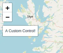
}Here we have a custom control that renders a <div> with some text. The leaflet-bar and leaflet-touch classes are
just some classes from Leaflet that we can use to keep the style of the control consistent with the default Leaflet appearance.
When we view our map now, we will see our custom control at the top left of the map below the native zoom control. No overlap 🙌!

Problem Solved
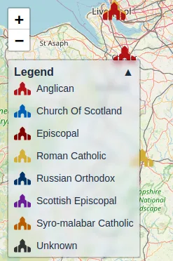
With the MapControl component I can go back and supply my legend control as a child and it should no longer have
positioning issues.
<MapControl position="topleft" disableClickPropagation={true}>
  <MapLegend entries={cathedralLegend}/>
</MapControl>Success! My custom legend control as been integrated with Leaflet’s internal layout flow 🥳.

Comparison with other approaches
There exists a package called react-leaflet-custom-control that takes a similar portal based approach. However, our implementations differ slightly.
My approach uses the Leaflet API to create a new control, then the container for that control is used as the portal target.
On the other hand, the react-leaflet-custom-control package gets its portal target by using getElementsByClassName 3 to
retrieve a reference to the appropriate Leaflet corner container e.g. <div class='leaflet-top leaflet-left'>
or <div class='leaflet-top leaflet-right'> etc…
Though our approaches are similar, the approach I’ve laid out here may be preferable over the package if you want to leverage Leaflet’s API and have it responsible for placing the controls or you just want to avoid having another dependency.
Another alternative is a function provided by React Leaflet called createControlComponent 4 .
This function wraps a Leaflet Control class in a React component, making it particularly valuable when integrating
existing Leaflet controls.
A typical createControlComponent approach might look something like this:
// Leaflet Control defined using Leaflet's Control class
const InfoControlDefinition = Control.extend({
  onAdd: (map) => {
    const container = DomUtil.create('section');
    container.innerHTML = `
      <div class="leaflet-bar leaflet-touch">
        <p>A Custom Control!</p>
        <button class="info-button">ℹ️</button>
      </div>`;

    // Manual event handling
    const infoButton = container.querySelector('.info-button');
    infoButton?.addEventListener('click', () => {
      console.log('Info clicked!');
    });

    return container;
  },

  onRemove: (map) => {
    // Clean-up, remove event listeners, etc...
  }
});

export const InfoControl = createControlComponent((props) => new InfoControlDefinition(props));

// Usage:
<InfoControl position="bottomright" />
Using createControlComponent can be useful when integrating with existing Leaflet plugins or when you’re already familiar with the
traditional Leaflet control creation API. However, it often requires working with string-based markup and manual event handling.
In contrast the React portal approach, either mine or the one implemented in the react-leaflet-custom-control package,
comes with a couple of advantages that avoids these pitfalls:
- ⚛️ React-centric development: You can write controls using JSX/TSX syntax. This provides all the benefits of React’s component model and avoids string-based markup and manual event handling.
- ♻️ Reusability: The custom control component encapsulates the integration logic, making it easy to create multiple different controls.
Importantly, the portal approach doesn’t sacrifice any functionality from Leaflet’s API - you still have complete access to the map instance and all Leaflet’s features through the useMap hook.
Notes
- React Leaflet Example Control: https://react-leaflet.js.org/docs/example-react-control/
- React portal documentation: https://react.dev/reference/react-dom/createPortal
- React Leaflet Custom Control package portal logic: https://github.com/chris-m92/react-leaflet-custom-control/blob/master/src/Control.tsx#L43
- createControlComponent function: https://react-leaflet.js.org/docs/core-api/#createcontrolcomponent